
Spotlight: Quiq
Adam:
“Hey guys, Adam here. Today, we’re sitting down with our Creative Director, Jeff Petersen, to discuss the packaging we developed for Medically Correct’s new line of tinctures, tablets and gummies, Quiq. We were honored to be a part of this process, and we’re excited to talk with you guys about how we developed some of the early concepts. So, Jeff, walk us through our creative development process a little bit.”
Jeff:
“Well, every creative concept starts with a big idea. Those foundational concepts play a pretty critical role in the design process. In terms of Quiq as a line of products, that fast-acting, controllable element really felt important. We wanted the consumer to have an image in their head of a clean, more clinical product line.”
Adam:
“How much of the design process centered around compliance? For those of our viewers who don’t know, cannabis packaging laws are different than many other CPGs. How did that factor into the work?”
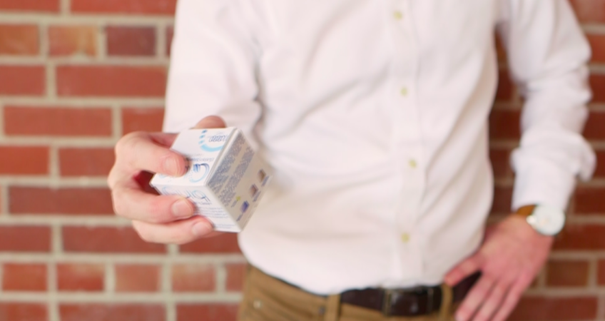
Jeff:
“This was one of the most interesting challenges we dealt with on this project. We had to communicate the complex cannabis health and safety information required by the industry in a way that was still eye-catching. We decided to let this information live at the bottom of the packaging, clearly displaying the dosage, but not distracting stylistically.”
Adam:
“Quiq’s target audience is a little bit different than that of many other cannabis products. How did the people we were trying to reach affect the final product in terms of packaging?”
Jeff:
“The target user here was someone looking to feel the effects of cannabis, but stay in control of their high. We tried to evoke a more traditional look in terms of packaging, which was in contrast with some of the psychedelic visual communication competitors in the space are using.”
Adam:
“What is the takeaway that you think a potential customer gets when they see this package on the shelf at their local dispensary? What feelings does it evoke?”
Jeff:
“We wanted to create a clean aesthetic using white space, a strong logo, and a secondary product descriptor. The resulting work was a no-nonsense, respectable, and refined solution that would tell customers they could trust Quiq.”
Adam:
“We always talk about how collaboration is important to us, and this project was no different. Direction from the team at Medically Correct helped guide our vision, and led to effective, dynamic design. Can you describe that collaboration process a little bit?”
Jeff:
“We did all the concept work, and then Medically Correct’s design team, led by Johanna, really brought it home. She created the infographics, and worked on countless iterations of copy and layout before it was ready to hit the shelves. We couldn’t have done what we did without her and the rest of MC’s team!”
Adam:
“We expect Quiq to rapidly become one of Medically Correct’s best-selling product lines. Look for it at your local dispensary today!”
sophie-mann
I’m Sophie Mann, and I work at encite branding + marketing + creative as Vice President of Strategy. My job entails a continuous study of business, marketing, data and culture, all in the name of driving strategy forward. I’m passionate about helping brands resonate more strongly with their consumers and communicate with their ideal clients. I’m also a proud graduate of the University of Kansas - Rock Chalk!