The Logo Design Process: An Inside Look
For every great logo, there a thousand bad ones – and it’s generally pretty easy to tell when something was rushed compared to something that was based in strategic thinking.
If you’re just starting out and worried that you don’t have the ability to invest in a quality logo, try to remember that this is so much more than an icon. It’s the first impression your company makes with every potential target.
Plus, while you might be making an investment now that seems large, think of the money you could potentially be saving down the line. Patchwork logos that are thrown together by people who aren’t properly trained not only miss the mark when it comes to sticking with a defined look and feel, but pose the risk of copyright and trademark litigation.
So, where do you start with logo design?
Again, it’s best to think of your logo as your first impression.
Finding the elements of your brand that you want to highlight is the first step. And yes, it will be hard to narrow things down at first. But it’s important to focus on the image you want to resonate with your target audience. How do you want to be seen?
Here at encite, we generally start the discovery phase of our logo design process by getting to know you and your business a little bitter. The question isn’t only “What does this logo represent?” but “Who does this logo represent?” After carefully defining not only who our clients are but how they would like to be perceived, we can be much more strategic in our goals for the project.
The logo you choose needs to represent your brand attributes – in other words, what makes your brand your brand. What sets you apart? For instance, if you’re an edgy, in-your-face type of company, you can play around with being more aggressive or irreverent. If your focus is trust and professionalism, you’ll need to stick with a more traditional visual identity.
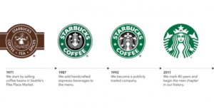
If all of this specificity and definition is feeling commitment heavy, try to remember that a logo isn’t a static entity – it’s allowed to adapt and change with your company. For instance, Starbucks has seen several iterations of its iconic logo.

While these all feel similar, we can see the evolution of the brand. Over the 40 years represented by that infographic, these changes seem natural – almost even expected.
When it comes to conceptualizing your individual logo, we’ll look at various design elements and see how we can play with them to make your message clear. Things like textures, colors, images, and inspiration from competitors and industry leaders all come into play here.
The first set of iterations we generally share with our clients are black and white versions of the various options we’ve been workshopping. The reason we like to do this is because it forces the viewer to really see the shape, texture and overall style of each logo as opposed to making an arbitrary statements like “I don’t like white text” or “I’d like green more than blue.” This isn’t to say that these opinions can’t or won’t be taken into account later, but at this phase we think it’s best to reflect on the most basic elements of each concept before we get ahead of ourselves.
After settling on a favorite option or two, we show you what it will look like in real-world applications. There’s something about seeing your logo on a business card that feels much more tangible than looking at concepts on a page.
If you’re looking to rebrand your company, or even if you’re starting from scratch, our Denver-based creative team is here to help.
