Originally founded in 2010, incredibles brand cannabis products have grown into Colorado’s highest-volume and most nationally awarded infused product company. incredibles has invested in long-term growth and, as a result, has solidified its position as a leader in consistency, delivering in the fields of product safety, ingredient quality and customer packaging.
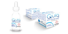
The objective concerned incredibles’ new line of tinctures, tablets, and gummies, Quiq. The new line needed a sophisticated packaging solution that had a science-forward look that evoked feelings of natural, clean products. The unique selling proposition of the products was that they are fast-acting, allowing users to feel the effects quicker. incredibles wanted to develop a product that allowed users to control their high, filling a need that other products don’t necessarily satisfy.
Strategy
One of the most interesting challenges facing advertising agencies today is the world of legal medical and recreational marijuana.
While this market as a whole has matured in the past few years, there is still an overwhelming amount of psychedelic, bold visual communication among competitors. incredibles wanted to position Quiq as a considerably more clinical, science-forward look and feel. It was important that the Quiq line stood out from all the other products in the dispensaries they were sold in. Since our primary sales channel was retail locations, it was imperative that Quiq dominated the shelf space.
We focused on a creating a clean aesthetic using white space, a strong logo, and a secondary product descriptor. We wanted to quickly deliver important information, like the fast-acting effects and ability to control your high. The resulting approach was a no-nonsense, respectable, refined solution which integrated type and color into a packaging design that showcased the company’s new line of modern cannabis products.
The icon itself was designed to act as a metaphor for a clock, and therefore the concept of time. This related to the fast-acting characteristics of the products, and could also be used in a variety of additional creative applications as a texture, background, super graphic, etc. ensuring consistency, congruency, and cohesiveness across the product line.
We wanted the user to immediately know what the product was upon a first glance at the packaging. By evoking a traditional, pharma-esque feel, we felt that we would appeal to your everyday cannabis user looking to get high quick, but stay in control. The challenge here is to effectively communicate the complex cannabis-related information in a way that was still eye-catching. Health and safety information live at the bottom of the packaging, clearly displaying the dosage, but not distracting stylistically.
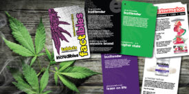
We also created branded, innovative, interactive point-of-sale brochures for budtenders in dispensaries where incredibles are sold, complete with information on dosage, pricing, and FAQs for people who might not be as well-versed in the terminology that goes hand-in-hand with the marijuana industry. It is not only a brochure the customer can take with them for reference, but a sales tool for the budtenders, making them look and sound more educated on the product. It also puts the incredibles brand directly in front of the consumer.
Target Audience
The main target audience for incredibles were cannabis users, both new and existing. In terms of existing customers, we targeted both males and females, generally falling in between the ages of 25-40. Existing users would be likely to engage with a product that is fast-acting. These users enjoy taking incredibles products recreationally, are social, like to go out, and have busy social lives. The control aspect would appeal to new users concerned by how exactly marijuana products might affect them. These users, again both male and female, skewed a little bit older – generally between the ages of 40 and 65. They don’t take marijuana products very often, and are less social than their younger counterparts. To appeal to this demographic, we determined that the brand personality needed to be approachable and exude feelings of trust and safety. The pharma aesthetic that we created helped us build trust and credibility with that demographic.
Results
The Quiq line was scheduled to launch in the first quarter of 2020, but due to Coronavirus concerns, they have delayed launch until after the virus has run its course. We expect Quiq to rapidly become one of incredibles’ best-selling products, have a distribution territory across Colorado and be available in medical and recreational dispensaries throughout the state.
Additionally, we saw an increased amount of awareness from the budtenders who benefited from our Factibles brochure.
Please note: In addition to graphic design, branding, and copywriting, our
marketing agency in Denver, Colorado also offers: strategic planning, social
media marketing and optimization, internet marketing services, public relations,
media planning and buying, and event marketing.


